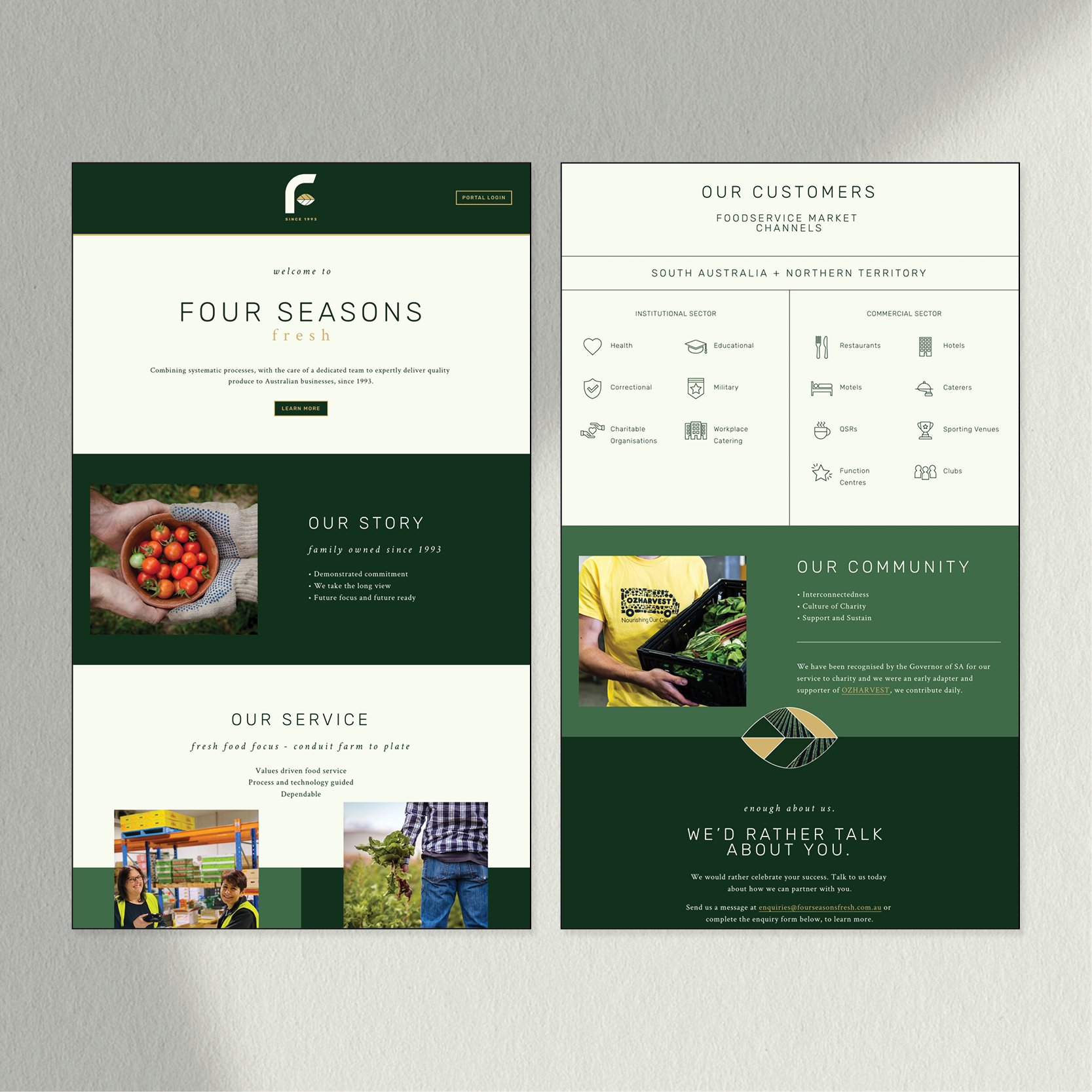
A Fresh Produce Brand, in Need of a Fresh New Look
The Business
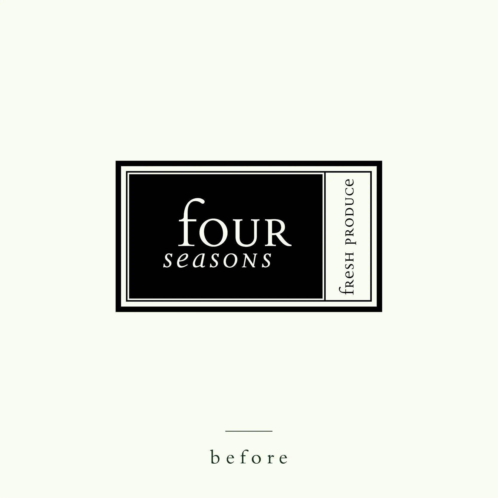
Four Seasons Fresh has been supplying fresh produce to commercial businesses across Australia since 1993. As a thriving family business, branding was never a priority. However, in recent years, new competition began to emerge. These competitors lacked the professionalism, experience and quality of service that Four Seasons Fresh has to offer, however these novice suppliers were able to effectively disguise their lack of expertise behind slick new branding. In order to remain a market leader, it was critical that Four Seasons Fresh establish a fresh new look, to better align with the prestigious service they were known for.
The Design Process
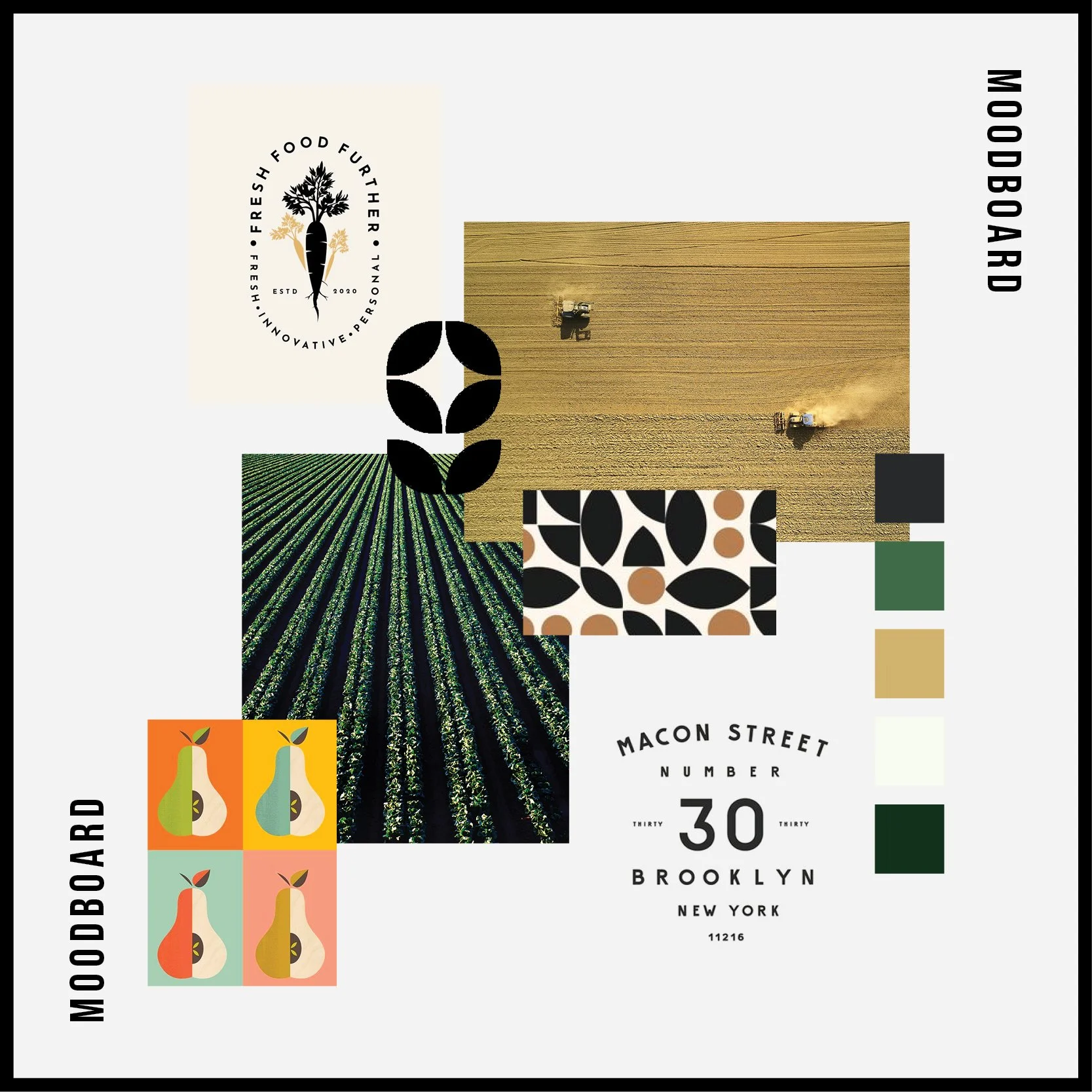
The brand needed to reflect both the traditional, personal, family-owned, nature of the business whilst also capturing a modern and innovative feel. The company is progressive and tech driven, and prides itself on its unique systematic processes that ensure produce is delivered as efficiently and reliably as possible. However, as a family-owned business, still offers an incredibly personal customer experience.
We were able to achieve a fusion between a progressive and personal brand feel by creating a juxtaposition in;
Typography - pairing a clean modern serif with a traditional sans serif
Supporting Graphics - utilising a clean and minimalistic icon as well as a traditional style illustrative pattern
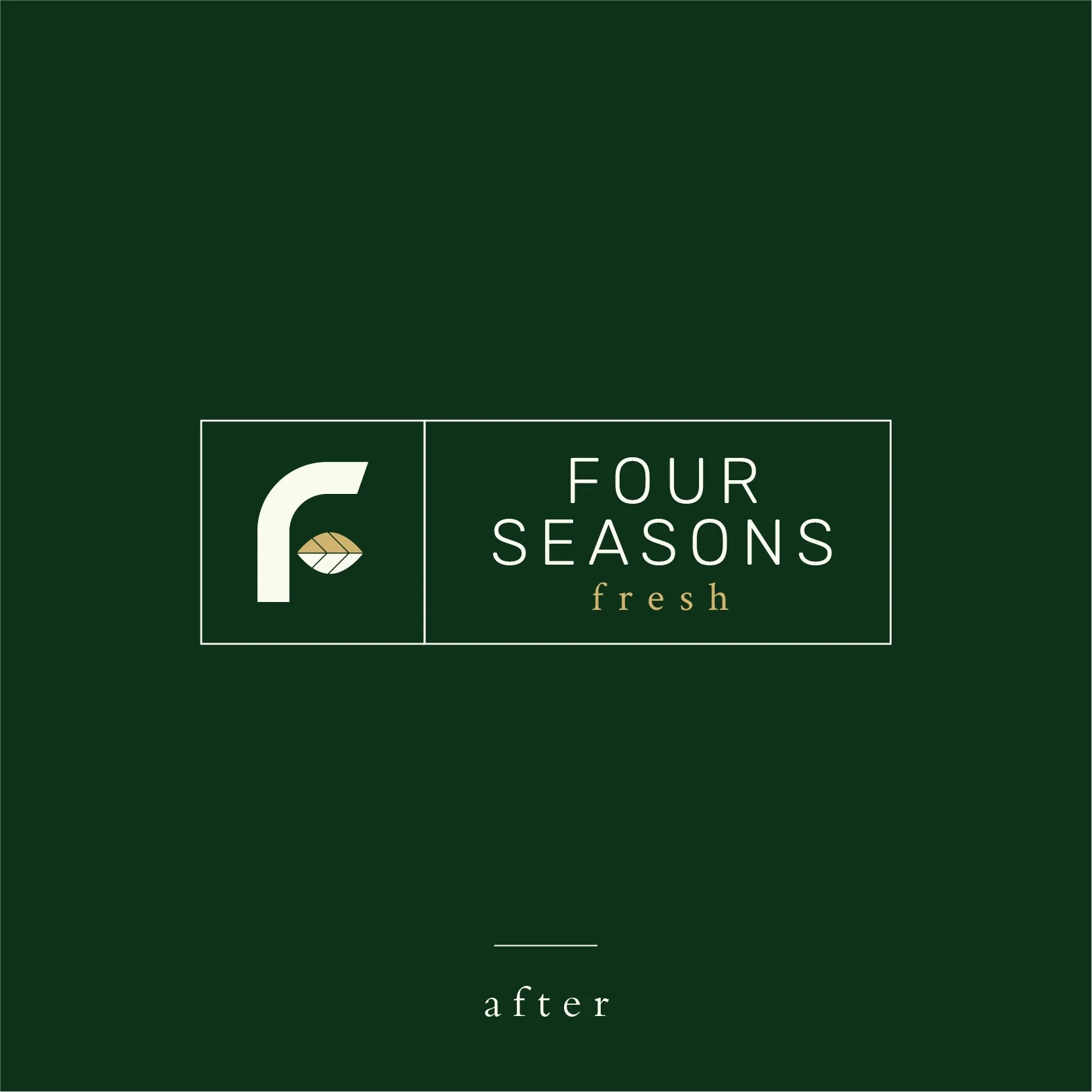
Logo Style - a clean and minimalist adaption of a traditional “label” style brandmark
The Result
With a clear idea of the brand story, we were able to breath fresh life into the original Four Seasons Fresh identity, and develop a distinctive brand, that was reflective of the business’ mission.

