The Ugly Duckling of the Brand House gets a Makeover
The Business
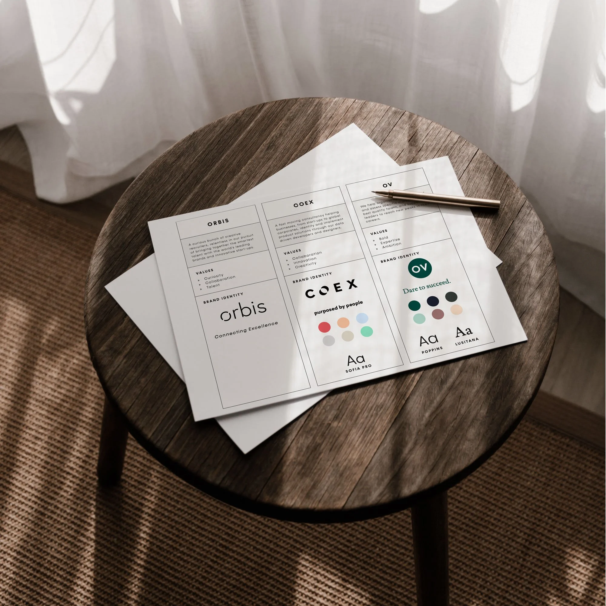
Orbis Recruitment, CoEx and OV Search, are 3 successful international recruitment companies, founded by the same team, targeting different areas of technology recruitment. CoEx and OV Search focus on executive level recruitment, and as a result, boasted beautiful and sophisticated branding. On the other hand, Orbis, specialising in entry level recruitment, had been left in a bit of brand neglect. When Hannah joined Orbis as the Global Head of Marketing, she embarked on a mission to give the business the branding it deserved.
The Design Process
The first step in the re-brand process, was to review the existing brand assets; not just for Orbis, by for the whole brand ecosystem. Essentially conducting a stock take of what each brand was comprised of, allowing us to see the strengths and weaknesses in the existing brands, as well as the opportunities for development for Orbis.
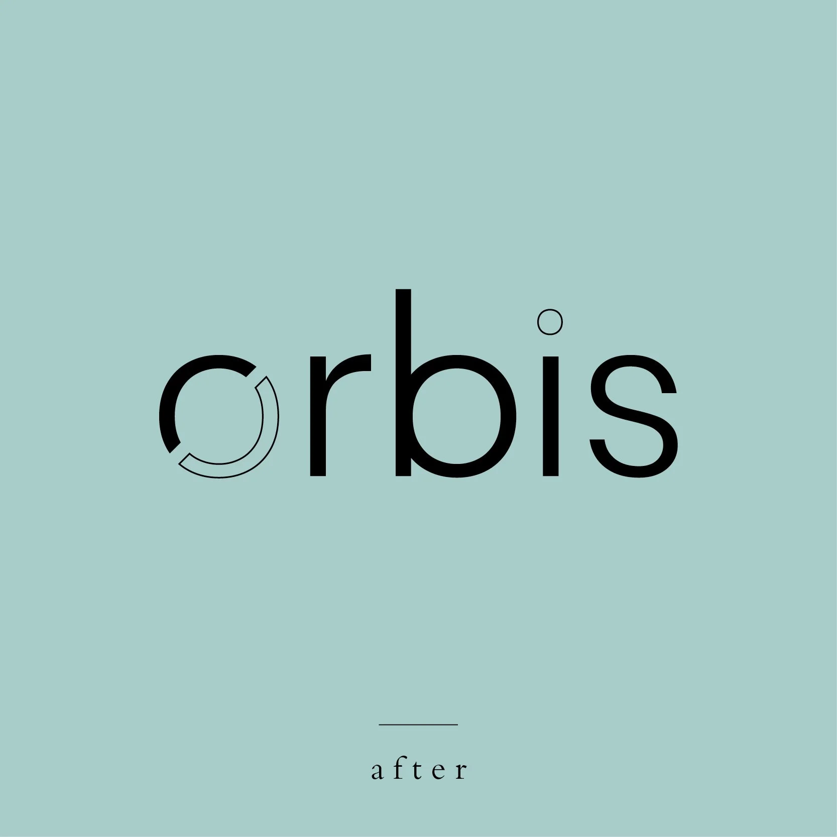
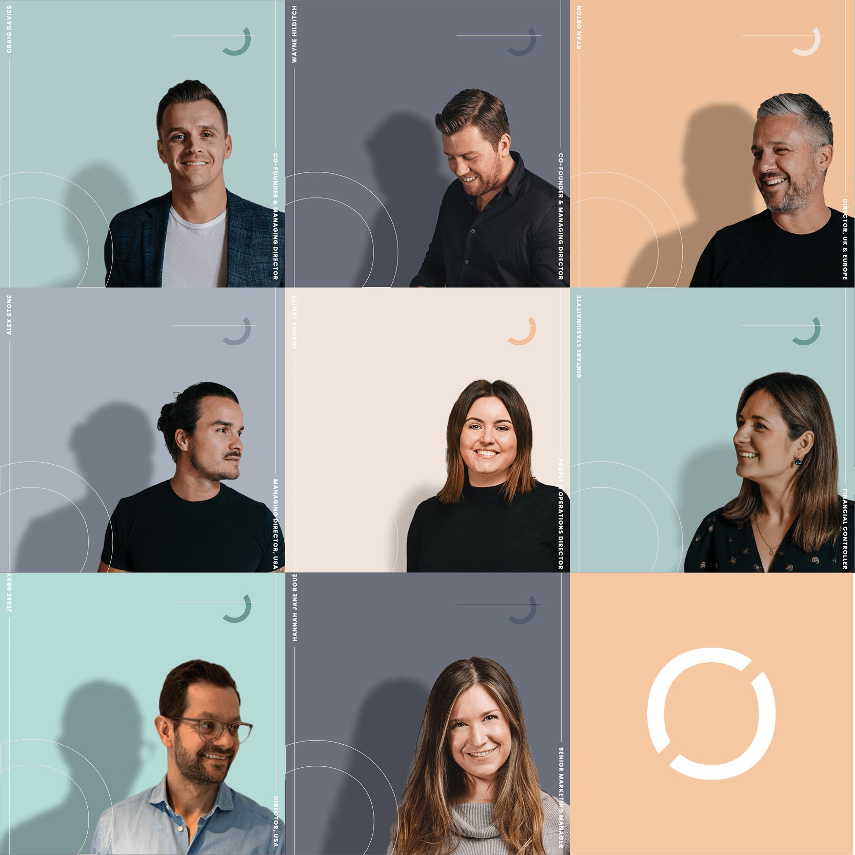
Orbis had a strong primary logo, which needed just a touch of refinement, to give it a level of sophistication that allowed it to sit equally with other brand house members, CoEx and OV. Beyond that, the brand lacked distinction. We needed to establish a colour palette, typography, supporting graphics and an image style that reflected the vibrant, modern and passionate talent the company was searching for.
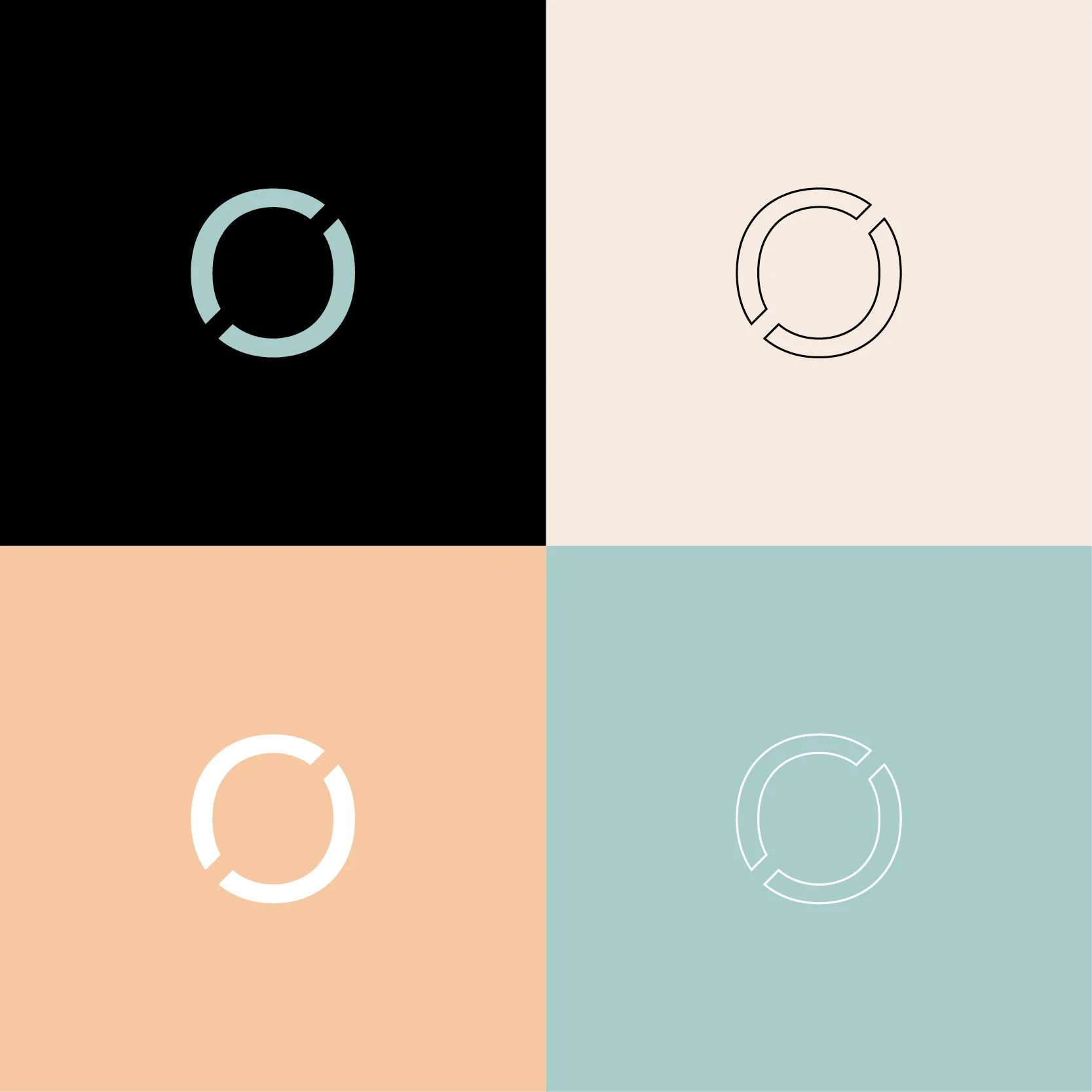
Minor adjustments were made to the primary logo, thickening the line work ever so slightly to ensure a more bold feel. A secondary logo was developed, which involved outlined elements, reflective of the dynamic and ever evolving nature of the business and tech industry. These outlined shape features could then be utilised as supporting graphic elements across marketing collateral. These shapes, paired with the unique and bold colour palette, transformed Orbis into a distinctive and captivating brand.
What We Made
Brand Identity
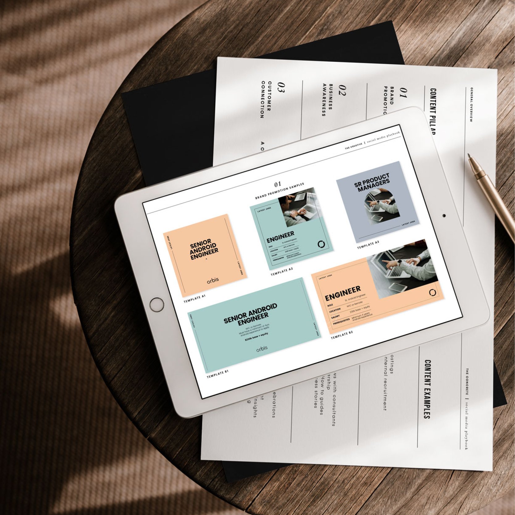
Social Media Strategy
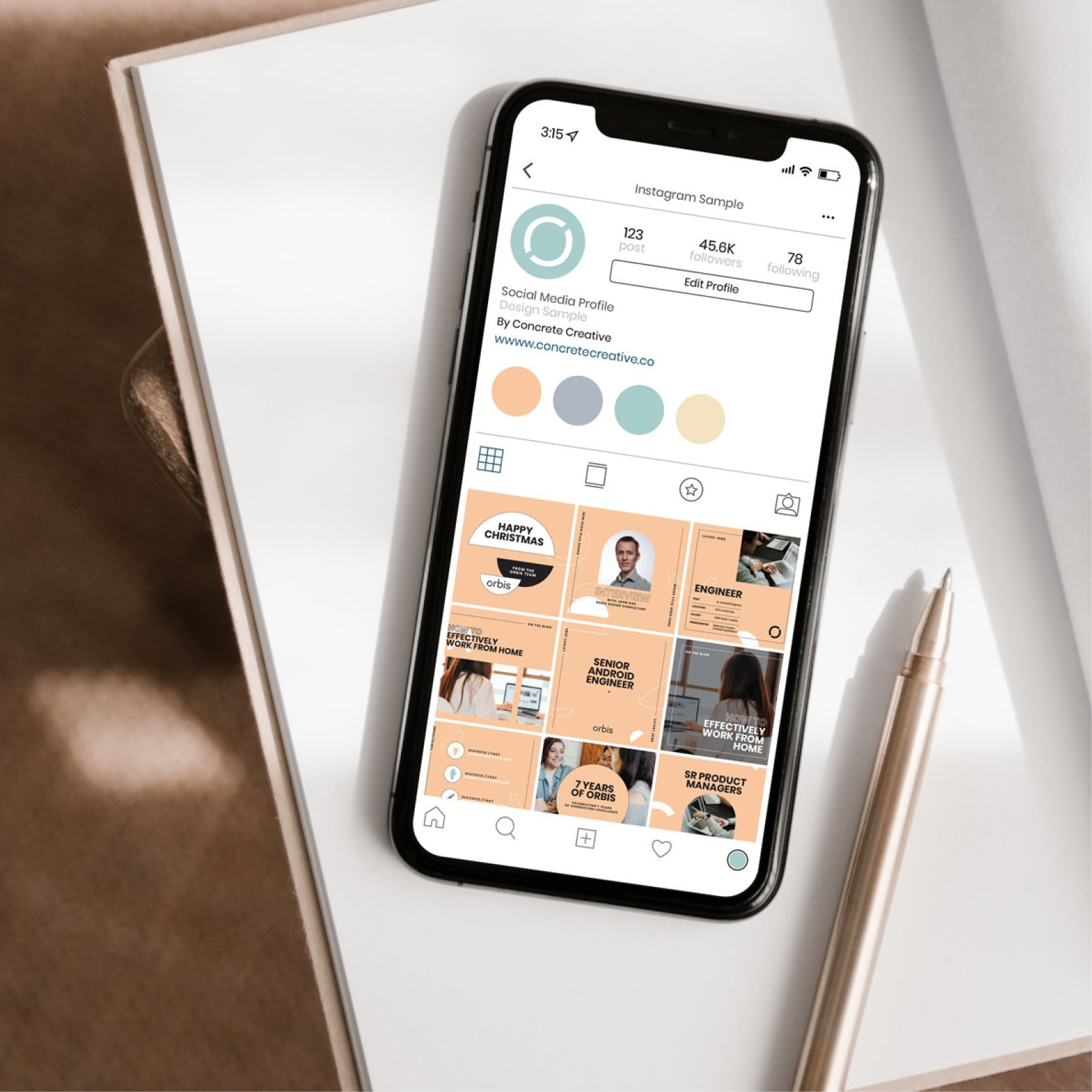
Social Media Templates
LinkedIn Profile Graphics
