The Making of FRANCIS West
A delicious brand design project
I’ve had the pleasure of working with the FRANCIS restaurant team for a number of years now, providing on-going graphic and web design services. Earlier this year, I had the absolute joy of helping restaurant founder, James Ward, to develop the brand for his second restaurant, FRANCIS West.
The Design Process
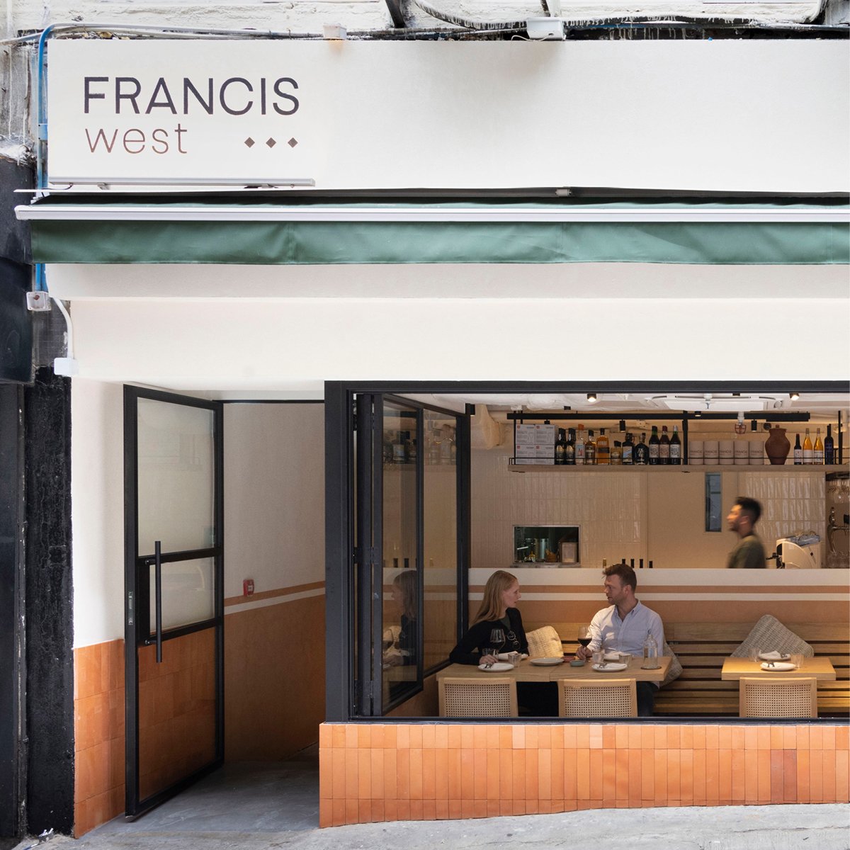
The creative direction for West was driven by our existing deep understanding of the FRANCIS brand and ethos, and guided by visual inspiration from the architecture team, as they concurrently worked on the design of the physical restaurant space.
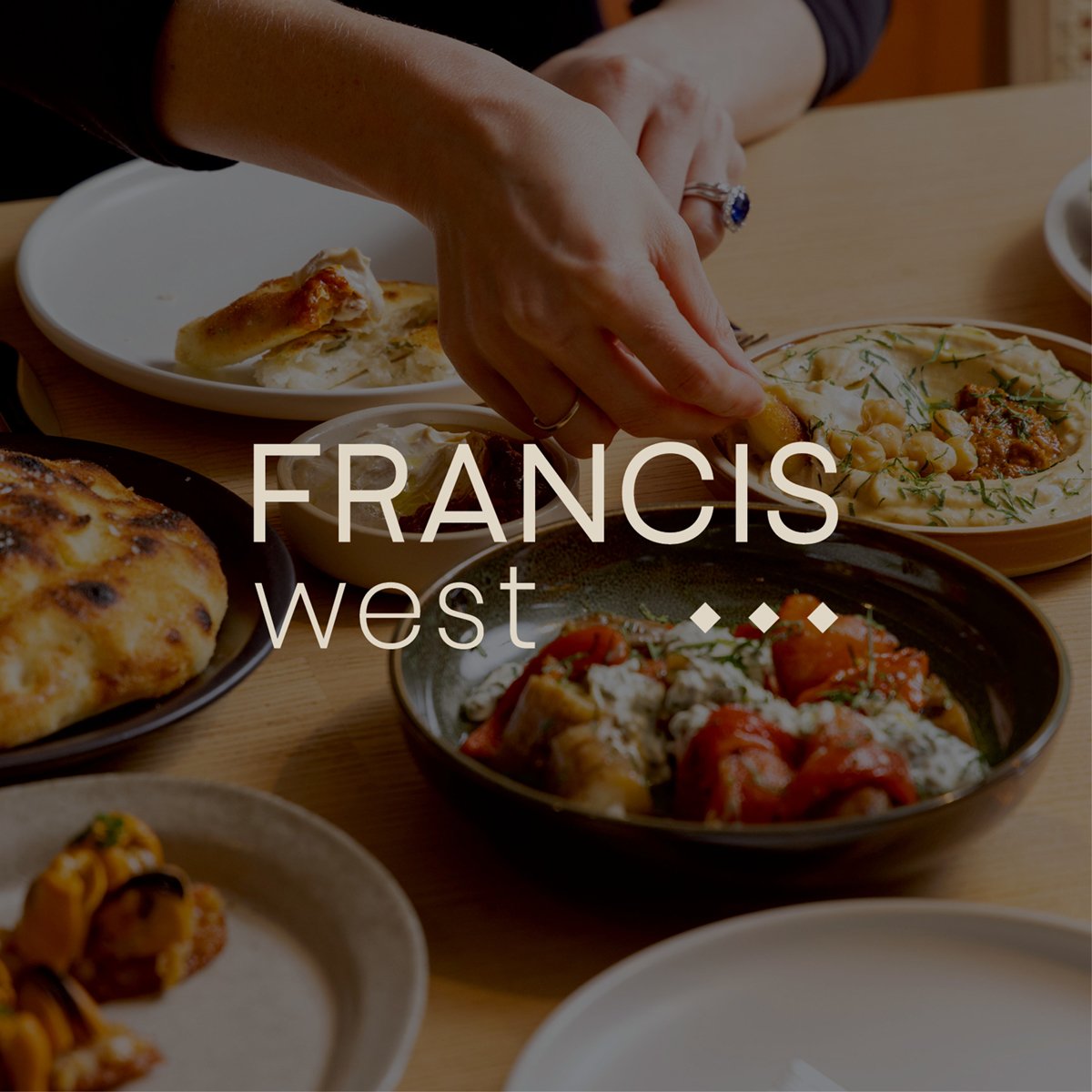
FRANCIS West needed to maintain the same neighbourhood feel, now synonymous with the brand, but we wanted to take the opportunity to give a bit more of a nod to the restaurant’s Middle Eastern cuisine, which is so unique to the Hong Kong F&B scene.
We used a number of design techniques to achieve this result:
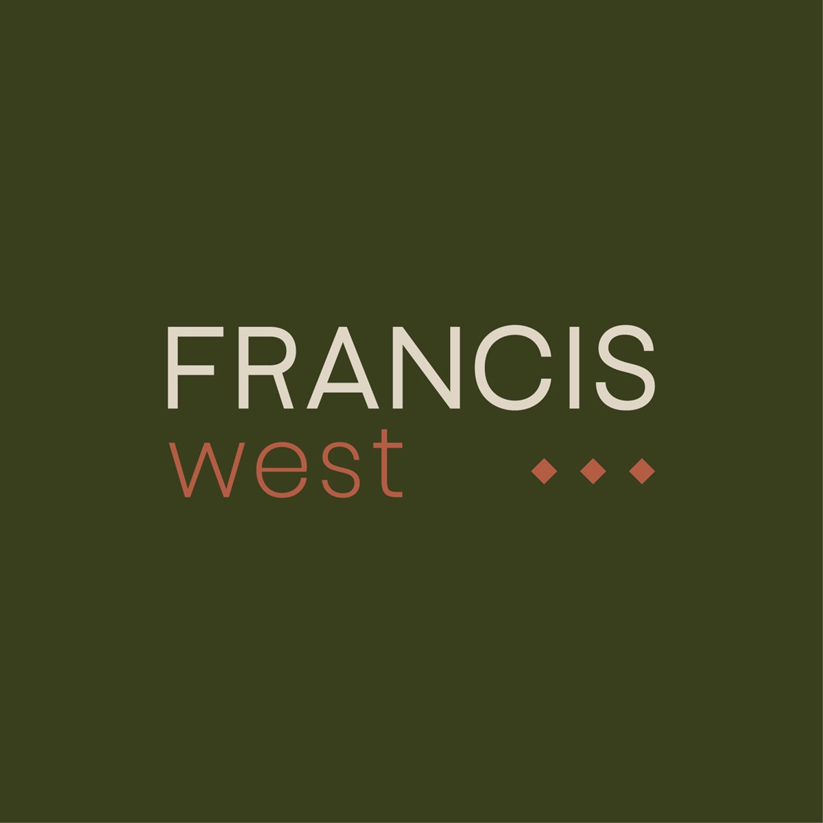
Typography - we maintained the same typography as the original FRANCIS logo, to maintain consistency with the well established and recongnisable parent brand.
Colour - we developed a more bold, Middle Eastern palette, leaning into the warm and organic hues, aligned with the interior design direction.
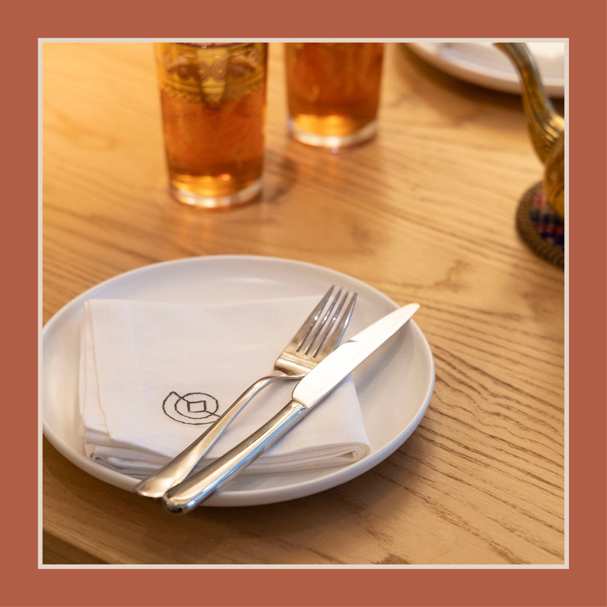
Distinctive Brand Icon - we developed a simple brand icon, to symbolise the signifcance of the restaraunt name; “West”. The menu is inspired by cuisines of the Maghreb region, (Morocco, Algeria, ,”برغم“ Tunisia and Libya). “Maghreb” is derived from the Arabic word denoting “the place where the sun sets” or “west”. The brand icon makes use of shapes synonymous with Middle Eastern design, to subtly depict the sun setting below the horizon.
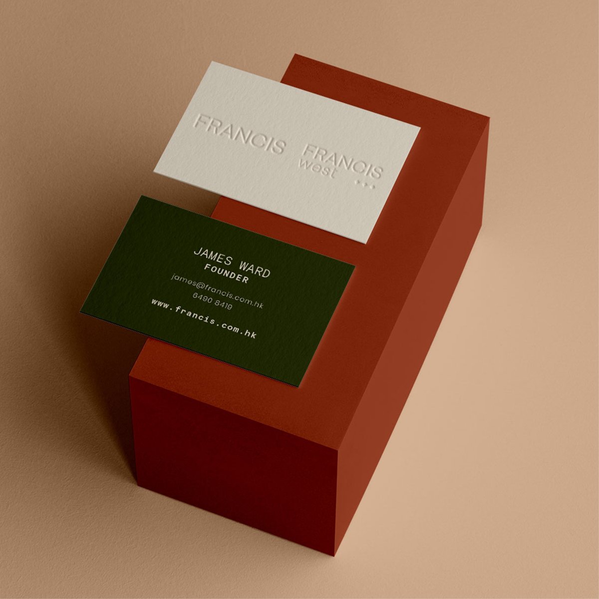
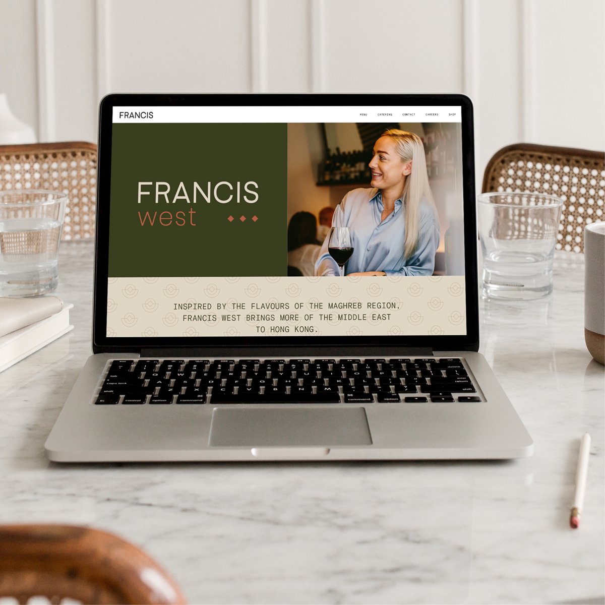
After establishing the brand identity, we went on to design business cards, email signature, menus and packaging. As the restaurant group now comprised of 2 unique brands, we also redeveloped the FRANCIS Squarespace website to reflect the new venue and service offerings.
What We Made
Brand Identity (logo, fonts, colour palette, brand guidelines)
Brand Stationery (business card, email signature)
Menu
Takeaway food packaging

