
Portfolio
Ursus
Transforming lives through fitness.
Project Overview
Industry
Health & Fitness
Location
Hong Kong
Deliverables
• Branding
• Squarespace Website
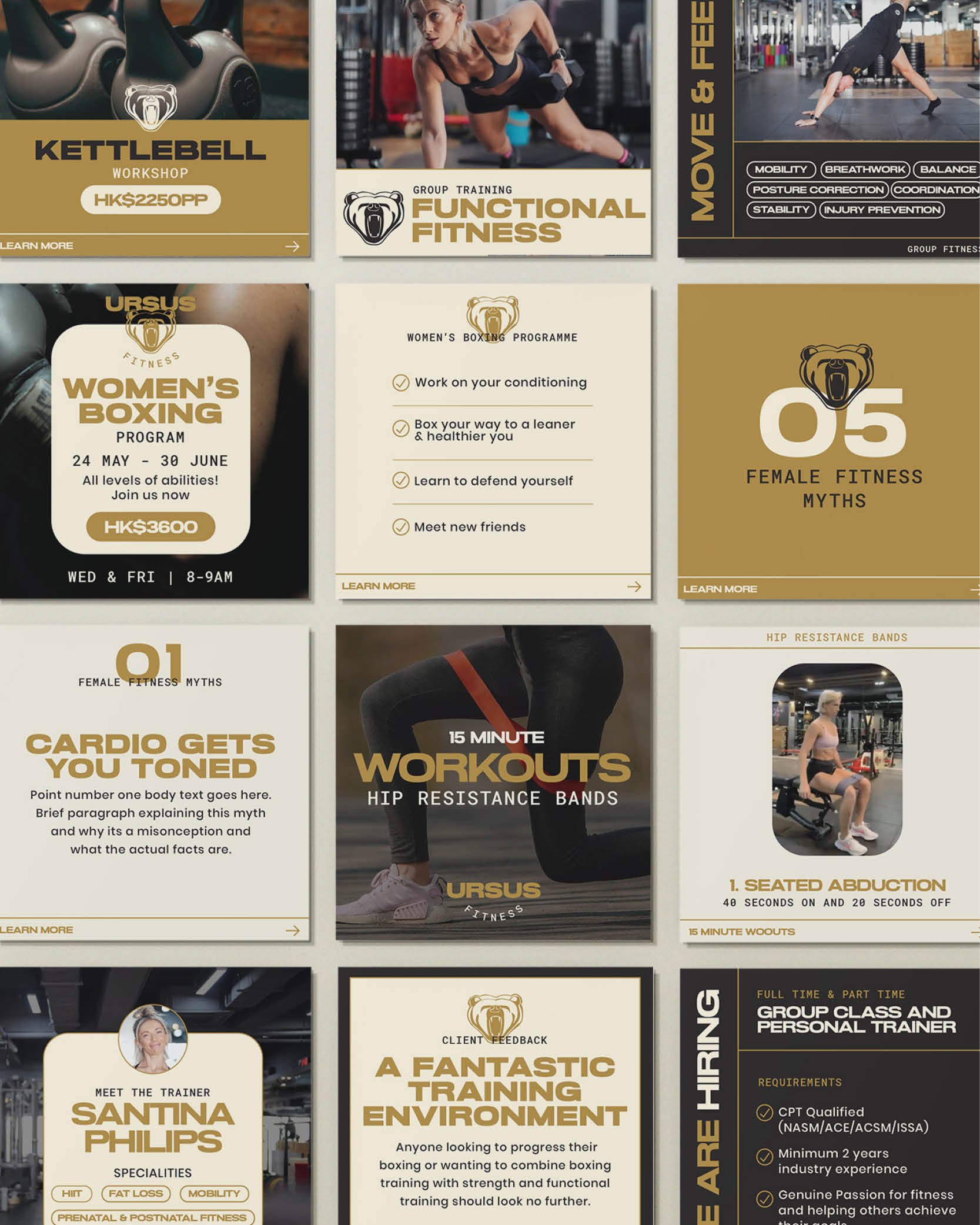
• Social Media Templates
The business
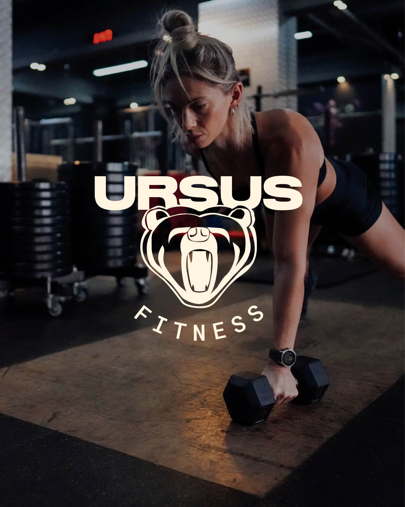
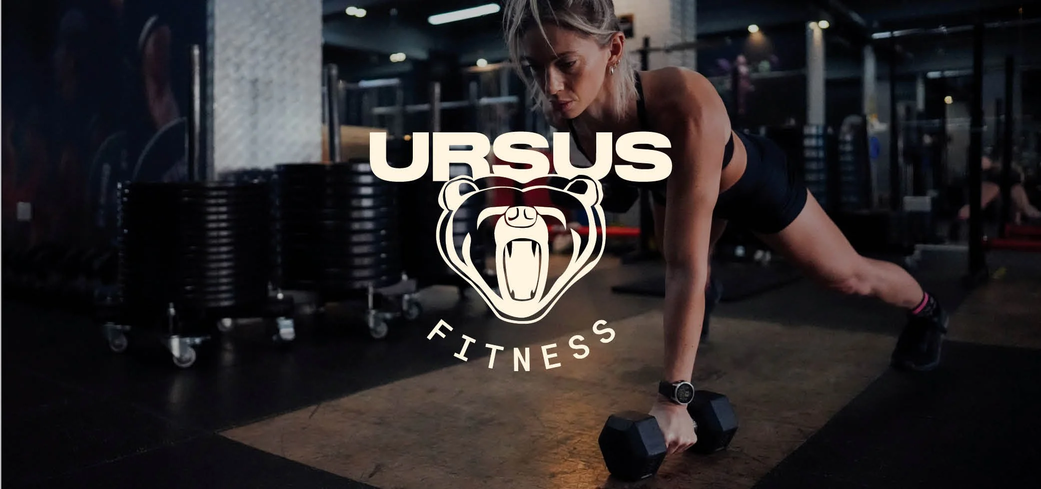
URSUS is a Hong Kong based gym, offering strength training, high intensity hybrid training and mobility. URSUS is also known for its high quality personal training and small group personal training sessions.
the CREATIVE DIRECTION
Fun-loving yet Empowering
Transformative yet Supportive
Dynamic yet Inclusive
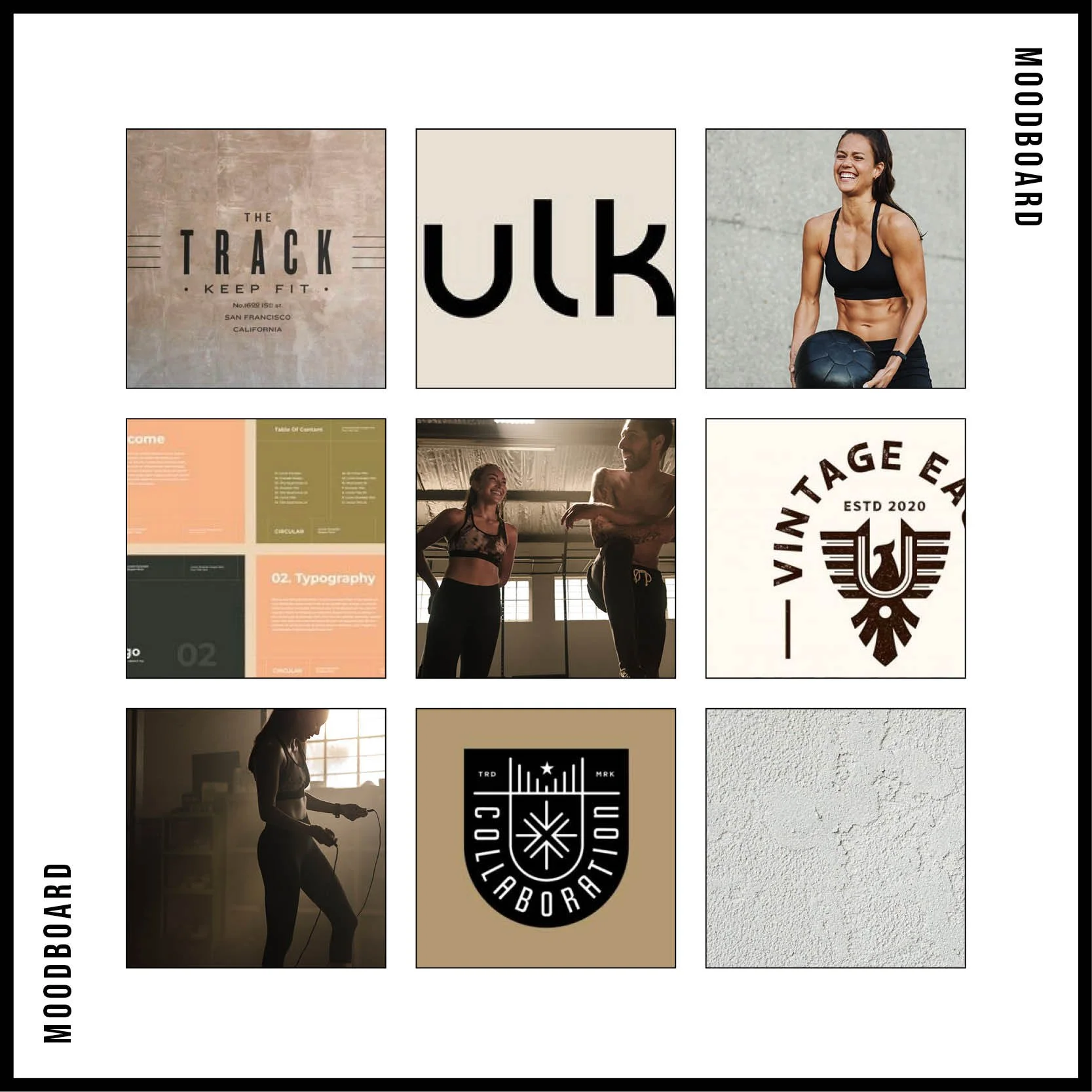
Case study
The Re-Making of URSUS
The Business
URSUS has been changing lives since 2015. At its most basic level, URSUS is a Hong Kong based gym, offering functional fitness, strength training, Muay Thai and boxing and personal training services. However, as a past member of URSUS, I knew the business was about so much more than that. I had experienced first hand the incredible fitness community offered at URSUS and knew to it’s members this gym was a sanctuary, a second home, and a place that encourages and supports transformative changes.
The Design Process
When co-founder Santina Philips, (Bam), approached me to help her rebrand URSUS, I was incredibly beyond thrilled. Bam explained how the business had changed and evolved, from its beginnings as an outdoor strongman bootcamp on Lamma Island, to it’s far more diverse and sophisticated gym offering in Sai Ying Pun.
Although there were elements of the initial brand that still resonated strongly with the team and community, overall the identity was incredibly aggressive and masculine; not at all reflective of the welcoming and supportive nature of the gym.


So, we went right back to basics, and put the URSUS brand through the Logos by Lanz re-brand process.
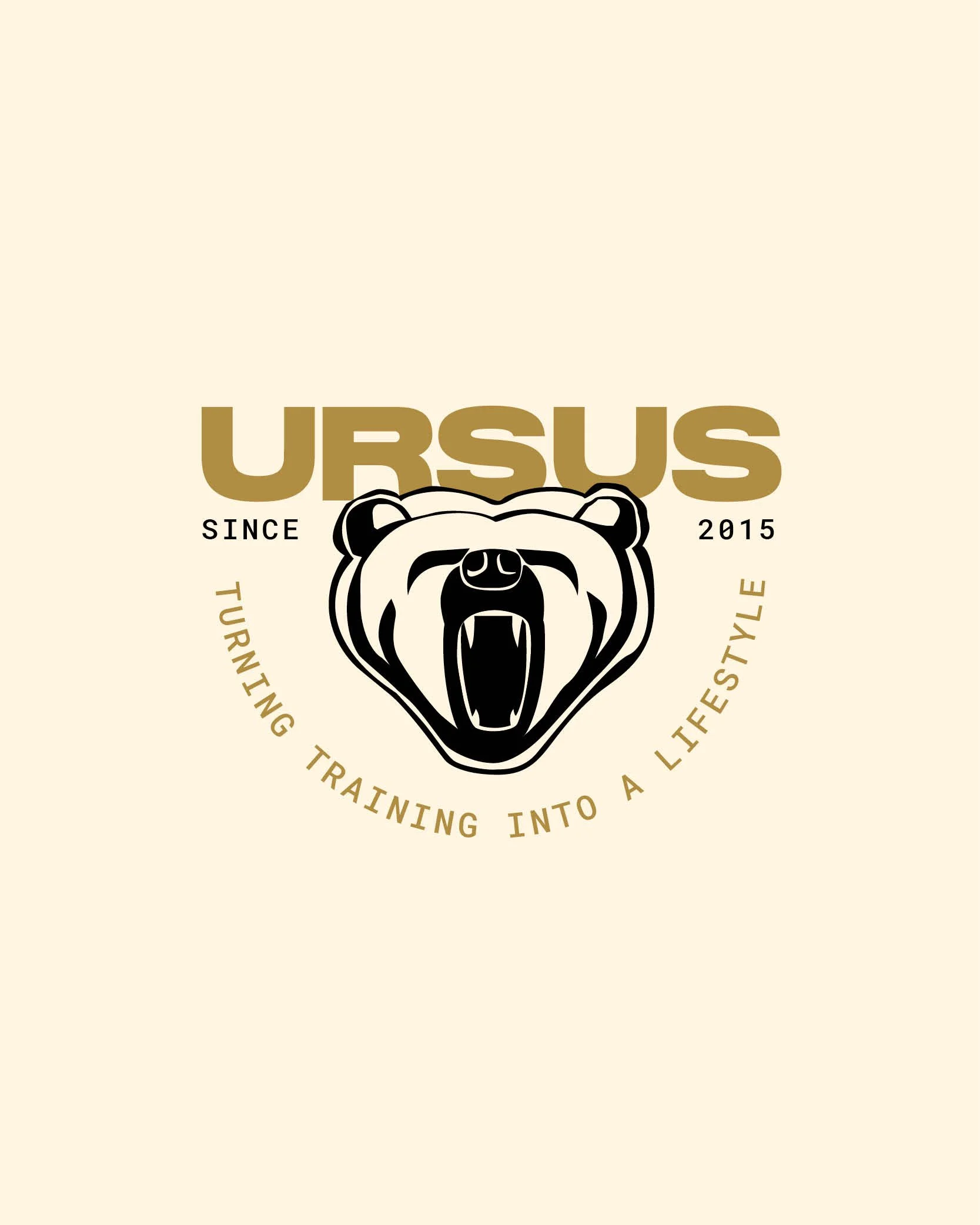
We knew we had to keep the iconic bear head; it had become synonymous with the URSUS brand, and was so deeply connected to the business name and origins. However, we made subtle modifications to the graphic; removing the claw marks, and simplifying the linework, to give a softer and more approachable feel.
Colour was also used to reposition the identity from dark and harsh shades, to warm, optimistic and welcoming tones. We also fine tuned the typography selection, to give the brand a more refined and professional feel.
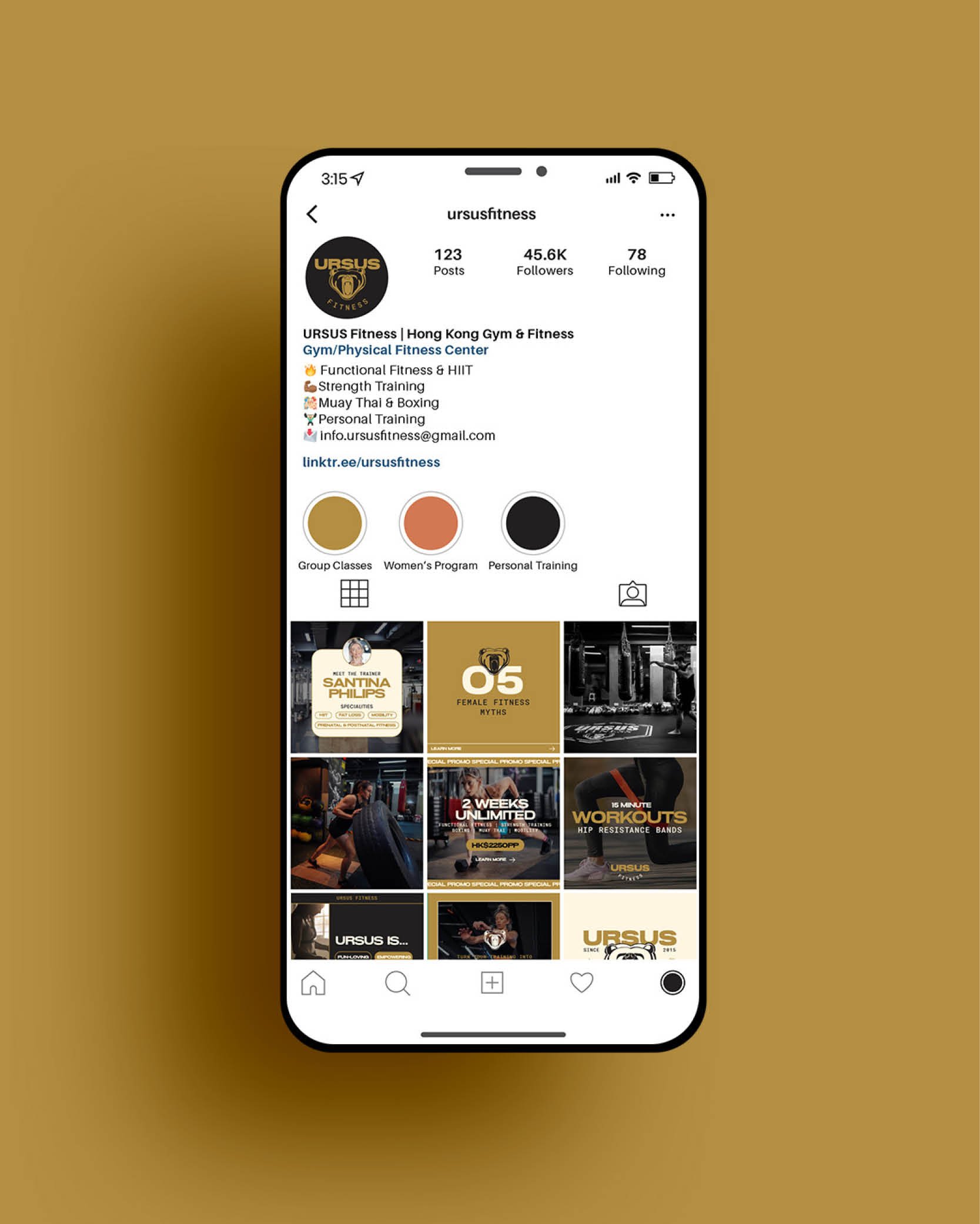
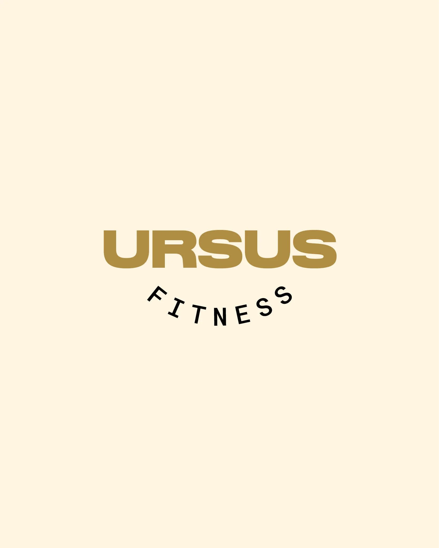
The updated typography, colour and bear head were then explored further, to develop a comprehensive logo suite for the business. Previously, URSUS had just one logo, which was difficult to apply in some use cases. Now, URSUS has a range of logos, including a typographic logo (text only) and an emblem (perfect for merchandise and to reinforce the sense of community and team spirit within the business). This set of logos provides maximum flexibility to effectively apply the brand across all touch points.
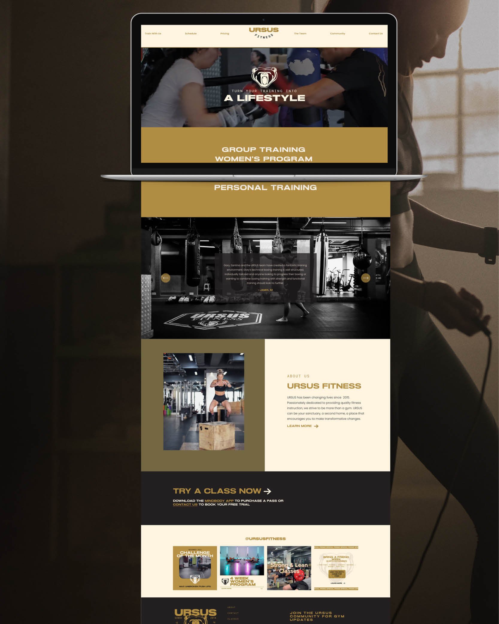
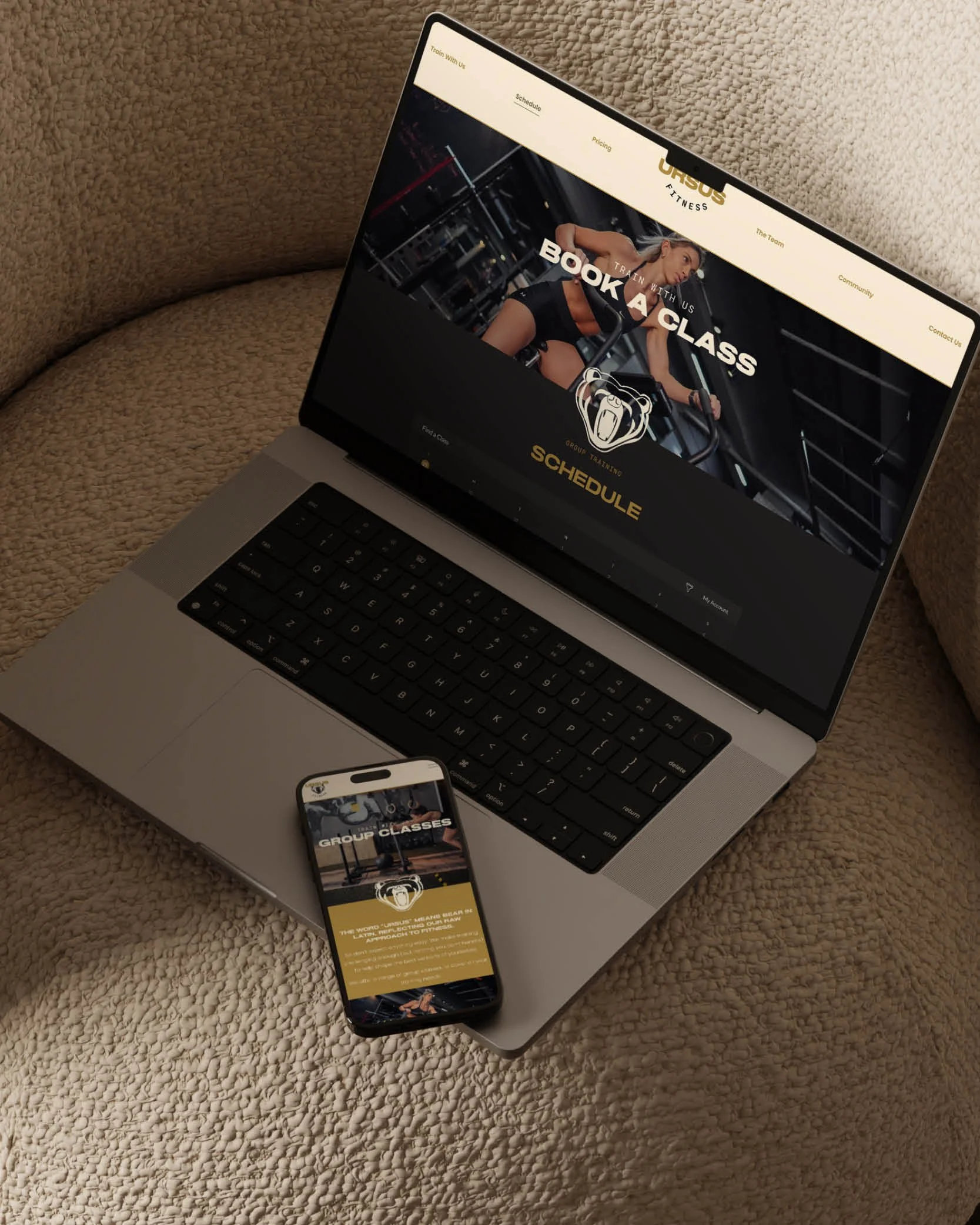
Once we had re-built the URSUS brand, we were then able to put it into action, with the design and development of a Squarespace website, and social media Canva templates.